
Srushti Satoskar
As a User Experience Designer I am dedicated to crafting intuitive and engaging digital experiences. My passion lies in designing experiences that foster connections and bridge the gap between the user and the design.

As a User Experience Designer I am dedicated to crafting intuitive and engaging digital experiences. My passion lies in designing experiences that foster connections and bridge the gap between the user and the design.
This project explores the intersection of colour psychology and educational virtual reality (VR) design. With the growing adoption of VR in education, especially post-pandemic, the study focuses on how colour schemes within VR environments influence student’s cognitive performance, emotional responses, and sense of presence during learning activities
Research Gaps
What the Project Aimed to Answer
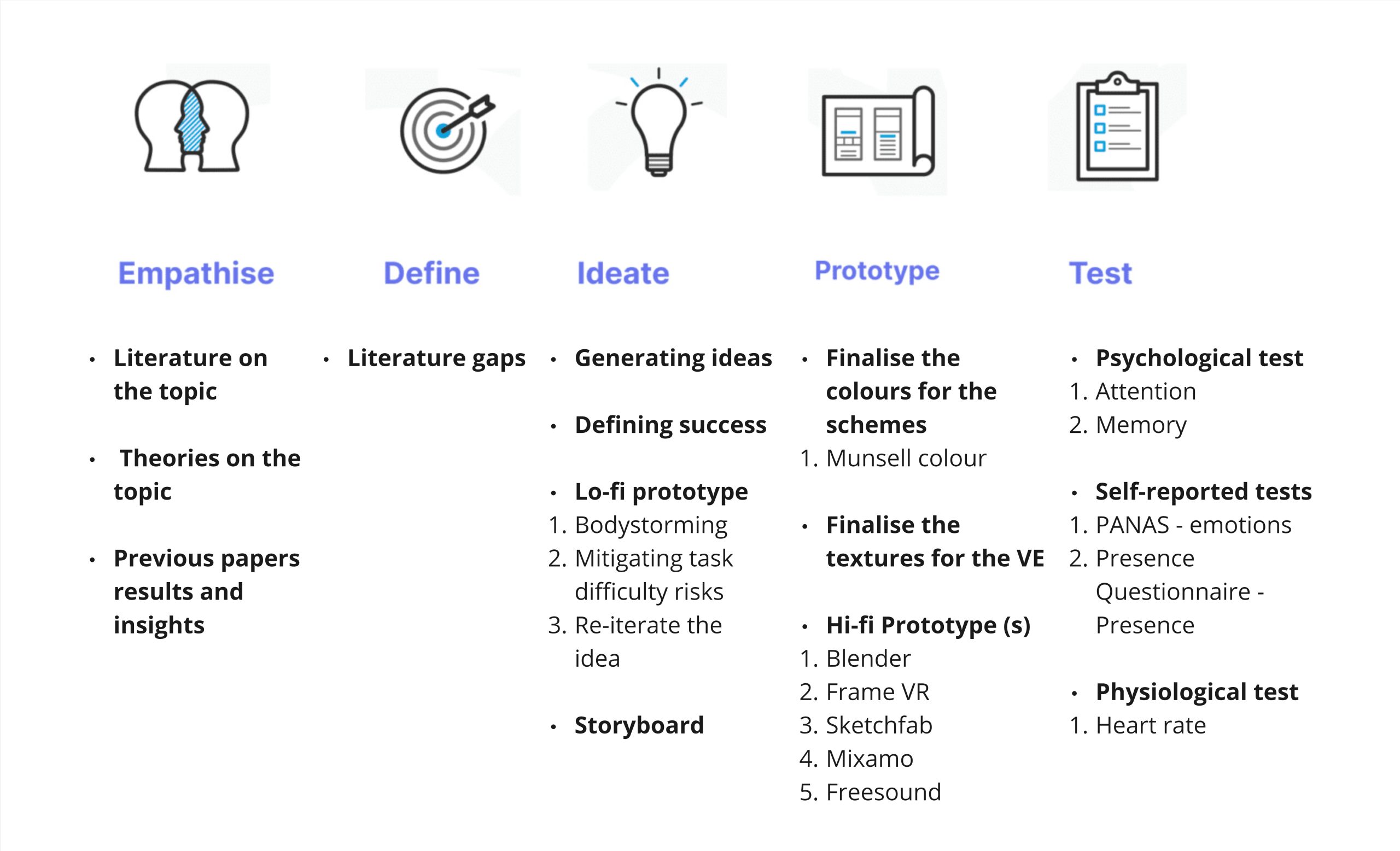
Design Thinking for Prototype Development
The Design Thinking methodology, consisting of five key phases – Empathize, Define, Ideate, Prototype, and Test, was employed as a strategic framework to tackle the aim. An iterative process of ideation, Prototyping, and Testing was used to answer the research questions
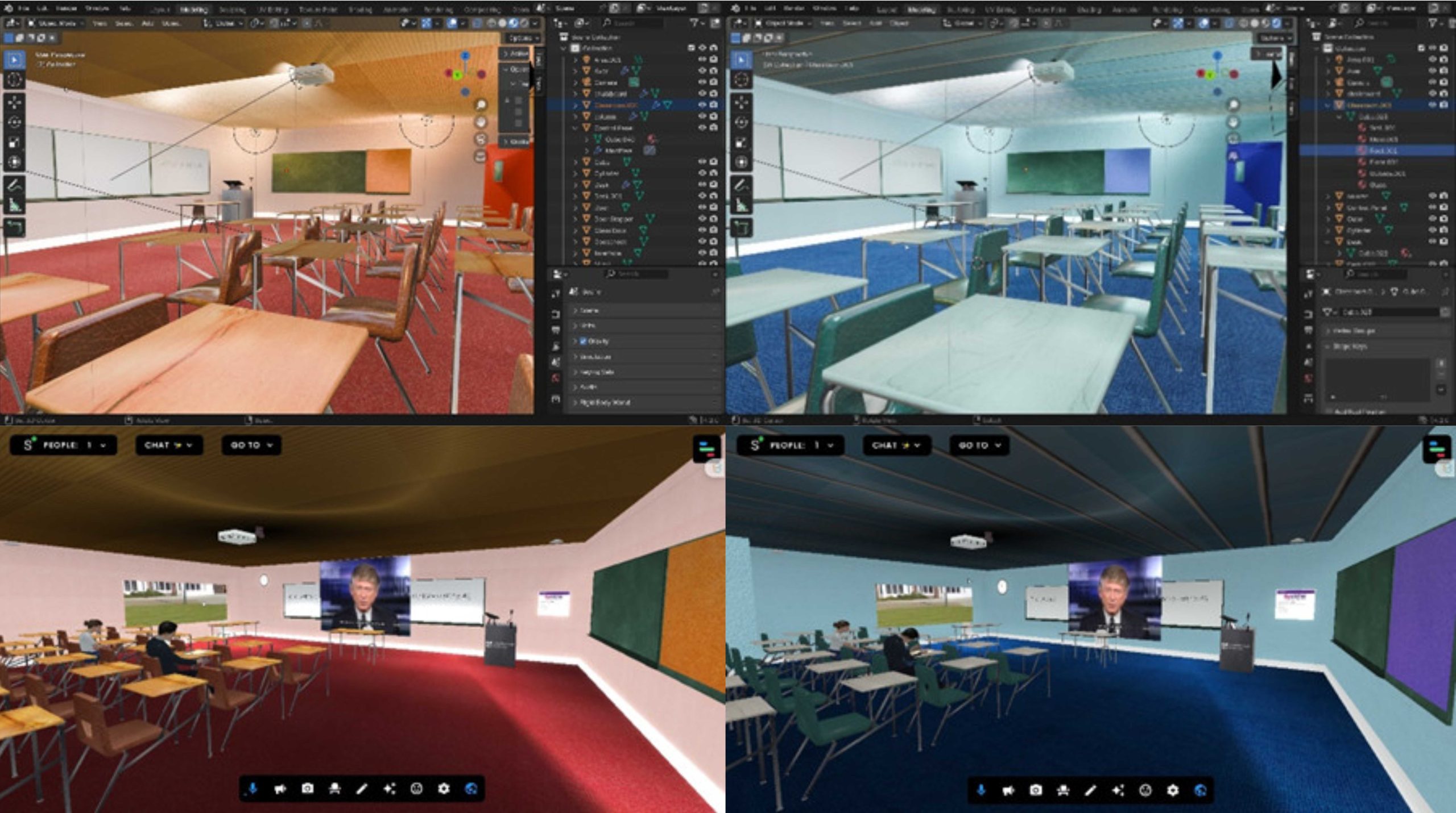
How the Prototype Works?
A VR classroom environment was developed to simulate real-world educational settings. The prototype includes two distinct classroom designs:
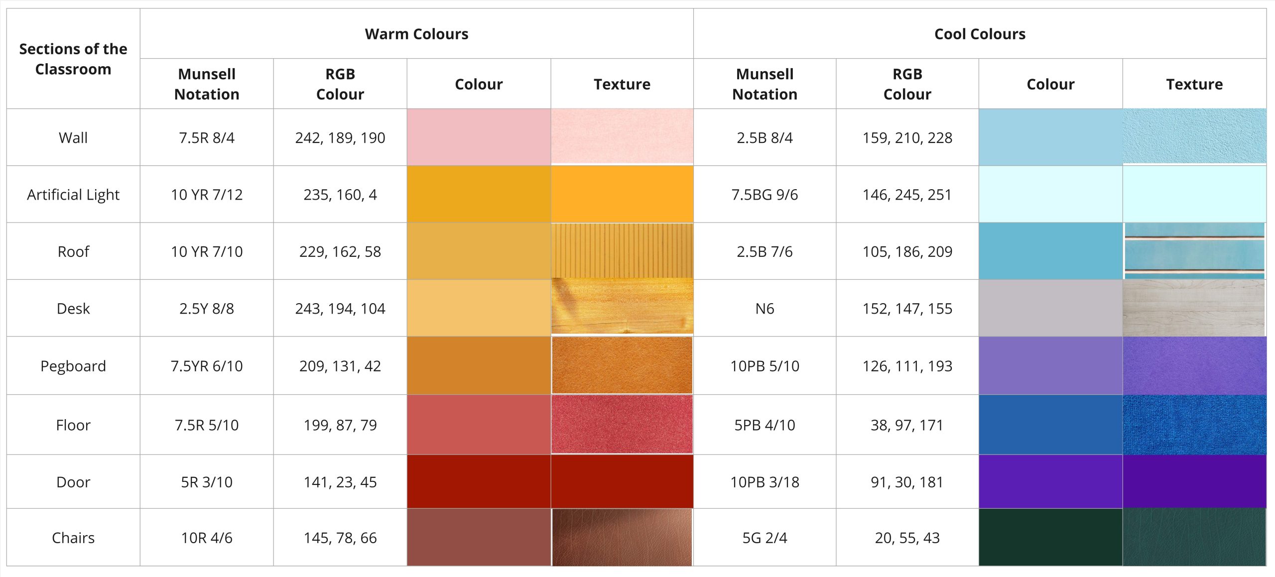
The Munsell colour system is a three-dimensional notation system developed in 1905 by Albert Munsell.
The research opted for the Munsell Colour system over any other because it offers a precise and standardised definition of colours which is crucial for assessing the impact of colour on both cognitive performance and emotions. The colours were chosen based on a combination of colours with different hues and chromas: 8 different hues for each colour scheme, a total of 16 configurations.
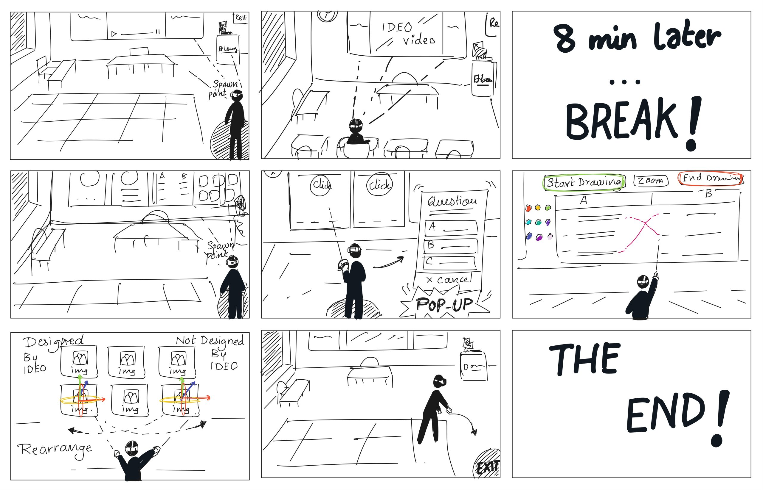
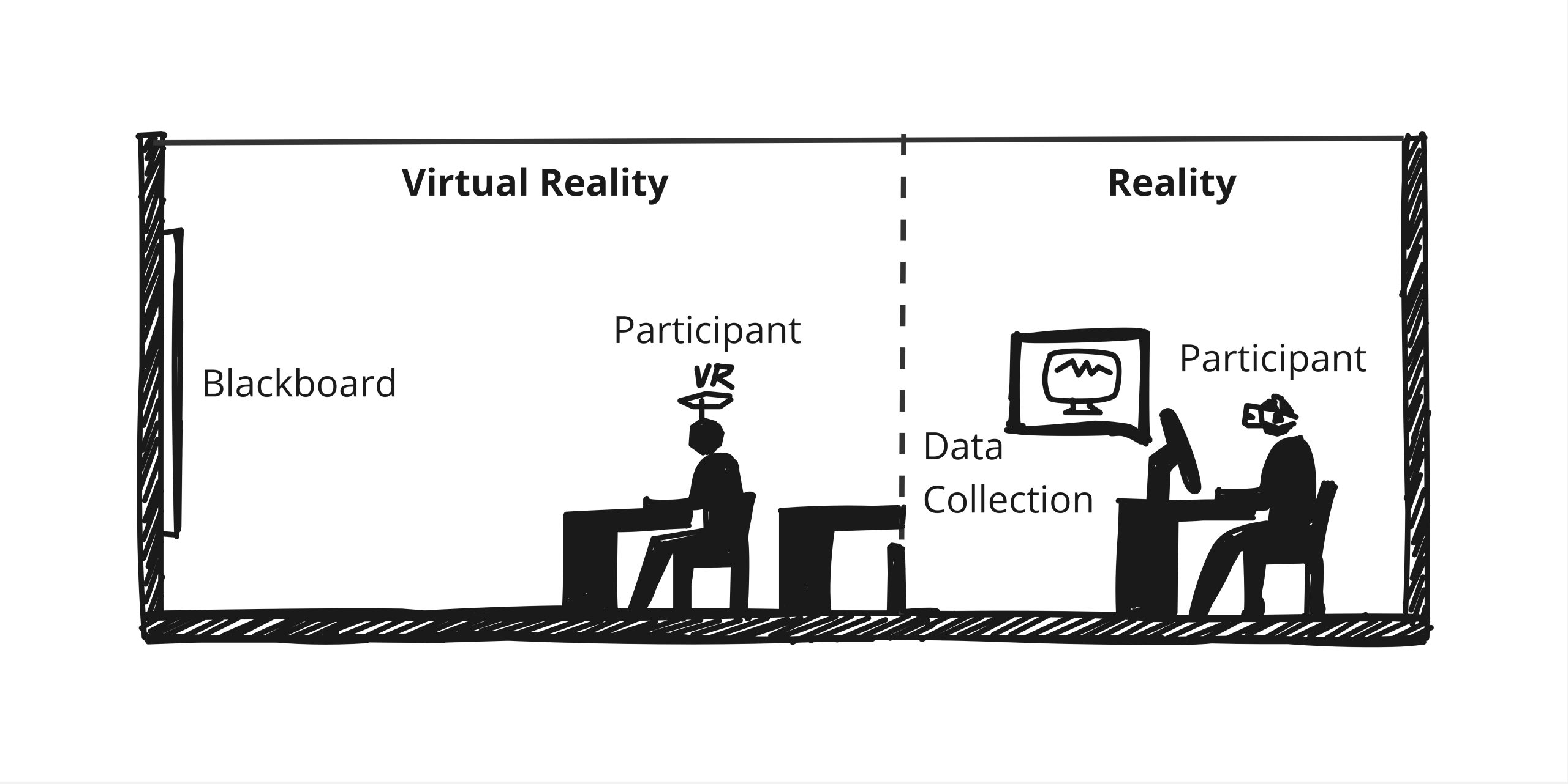
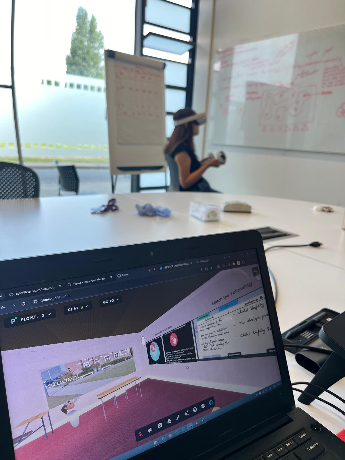
Participants in the study watch a lecture video in the VR classroom, followed by a series of memory and attention-based tasks to assess their cognitive performance. The study measures emotional responses using heart rate monitors and self-reported feedback to analyze the impact of the environment on learning and engagement.
The virtual simulation was designed using Sketchfab, Blender, and Frame VR software.
Testing the Prototype
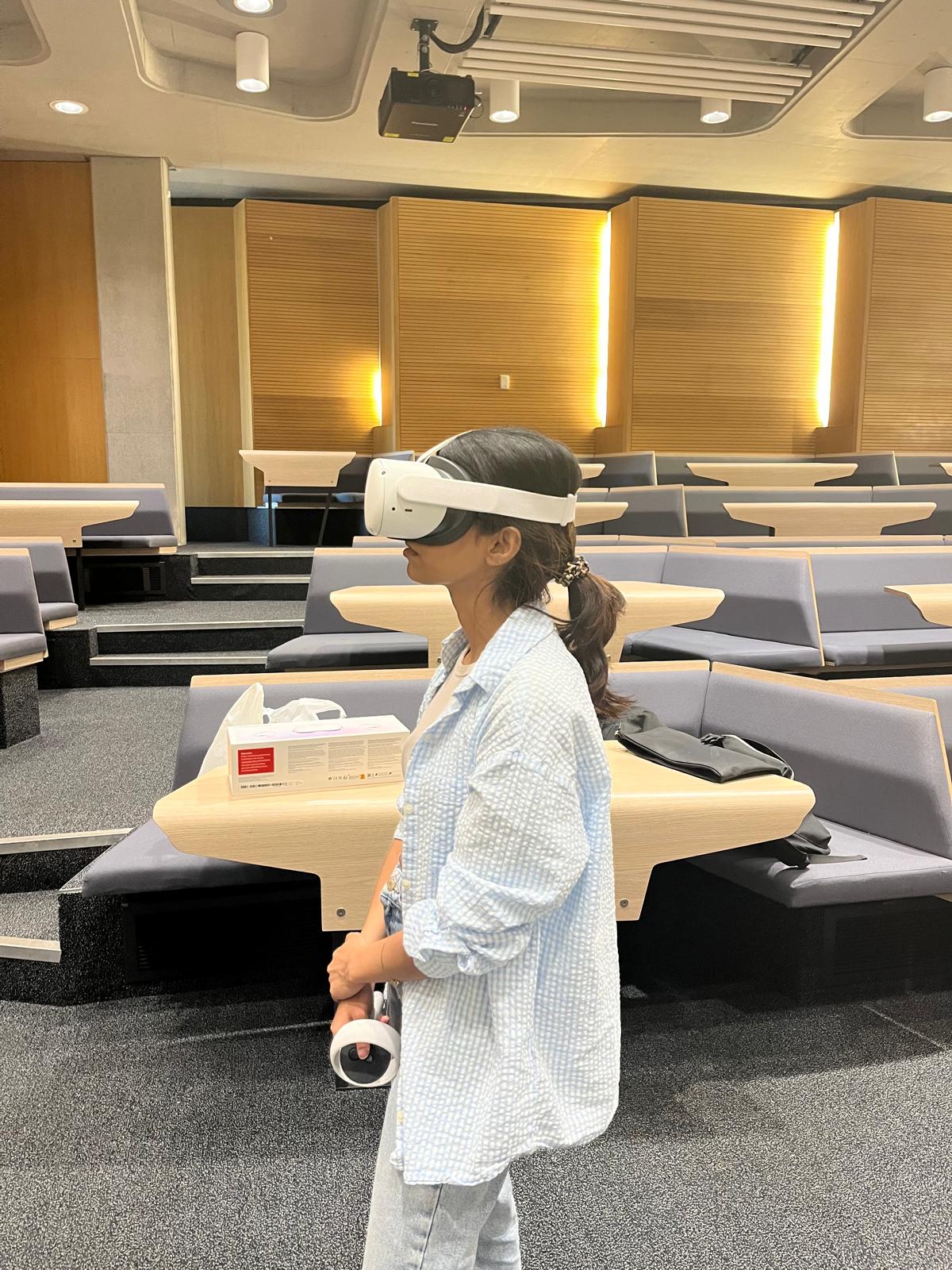
The study was conducted at Loughborough University over 60 minutes in a quiet setting. 30 Participants were recruited who first completed a D-15 colour vision test to confirm normal colour recognition. After briefing and consent, they wore an Apple Watch to monitor heart rate before, during, and after the experiment.
The study had two sessions:
This structured approach aimed to assess cognitive functions and emotional responses in the VR environment.
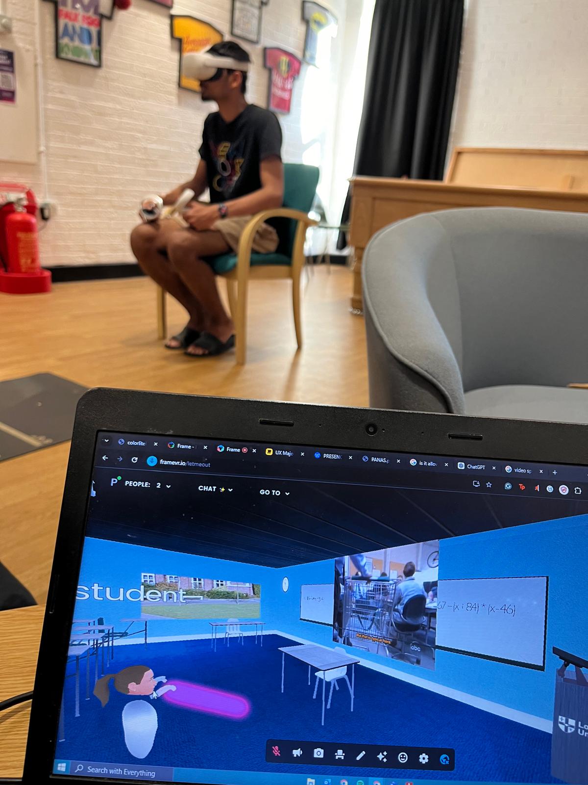
The research revealed that:
Design Recommendations
Based on the findings, warm colour schemes demonstrated cognitive benefits that stress the need to consider environmental design in educational VR settings. These findings have the potential to guide the development of more effective VR learning environments by focusing on those colours that more strongly engage cognitive processing. However, the inconclusive findings on emotional response and presence need further research on how different sensory elements—apart from colour—intersect to define feelings of immersion in VR.
Conclusion
This project highlights the importance of colour in educational VR design, particularly in fostering better cognitive engagement. While the results provide insights into optimizing VR environments, further studies are needed to investigate the broader implications of colour on emotions and presence in immersive learning. The current study is yet to be useful for a wide range of professionals involved in the design of research into teaching spaces and VR.