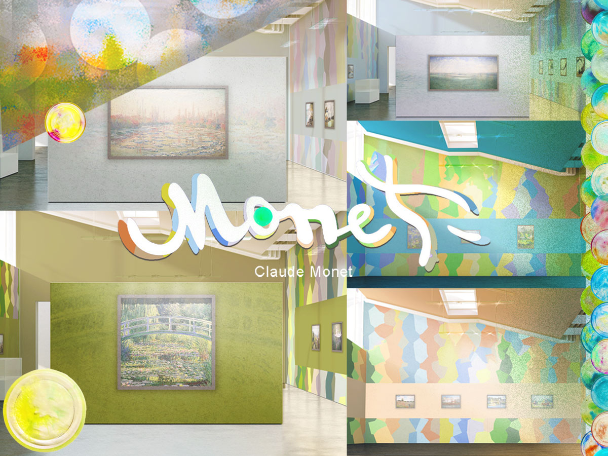
In this part, the exhibition creates five unique background wall visual designs through Monet’s paintings’ tones and emotional characteristics. These designs not only create a tranquil look with soft color transitions but also provide the audience with a spatial experience that is integrated with the artwork. Through precise color matching and design concepts, the exhibition hall background wall perfectly presents the concept of visual echo and emotional immersion, and the audience can feel the breath and flow of the work in it.
This section displays five exhibition hall background wall patterns inspired by Monet’s paintings. These patterns not only use color gradients and combinations to create a soft spatial atmosphere but also closely echo the exhibits, enhancing the audience’s immersion in the exhibition. The design of each pattern has been carefully selected to resonate with the artwork with rich visual language and form a visual echo.
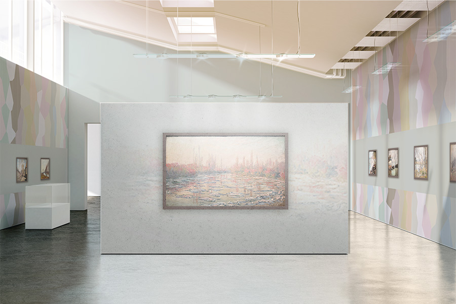
This hall is based on the color of dawn, and uses a gradient of soft pink and gray to construct the space background, presenting the hazy dawn scene in Monet’s paintings. The design of the wall color blocks is combined with light and shadow to create a soft and emotional visual experience for the audience, making people feel as if they are in Monet’s dawn world, feeling the moment of silence and the flow of light.
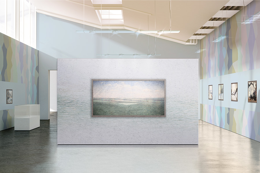
This hall is dominated by blue-gray tones, creating a visual effect of sea and sky connecting, as if you are in Monet’s seascape paintings. The soft gradient on the background wall echoes the light and shadow on the wall, bringing the audience closer to the ocean, bringing a calm and deep sense of immersion, and making people feel the boundless vastness and tranquility in Monet’s paintings.
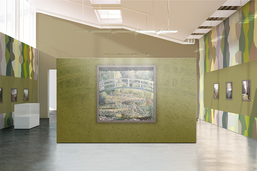
The hall is dominated by natural green, and the wall is designed with irregular color blocks, creating a fresh and natural atmosphere, which perfectly blends with the garden scene described by Monet. The gradient on the background wall contrasts with the painting of the Japanese bridge as if bringing the audience into the depths of Monet’s garden to feel the tranquility and beauty of nature.
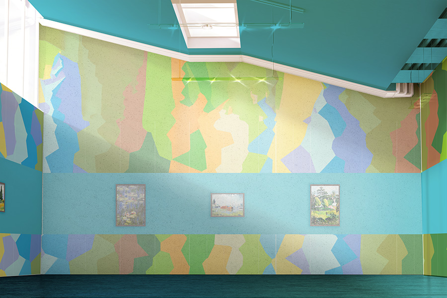
The hall uses bright and lively color matching, and irregular geometric color blocks to create a visual effect of color rhythm. The design of the wall is flexible and changeable, echoing the richness and expressiveness of colors in Monet’s works, leading the audience to immerse themselves in the dance of colors and feel the rhythm and vitality of colors in Monet’s works.
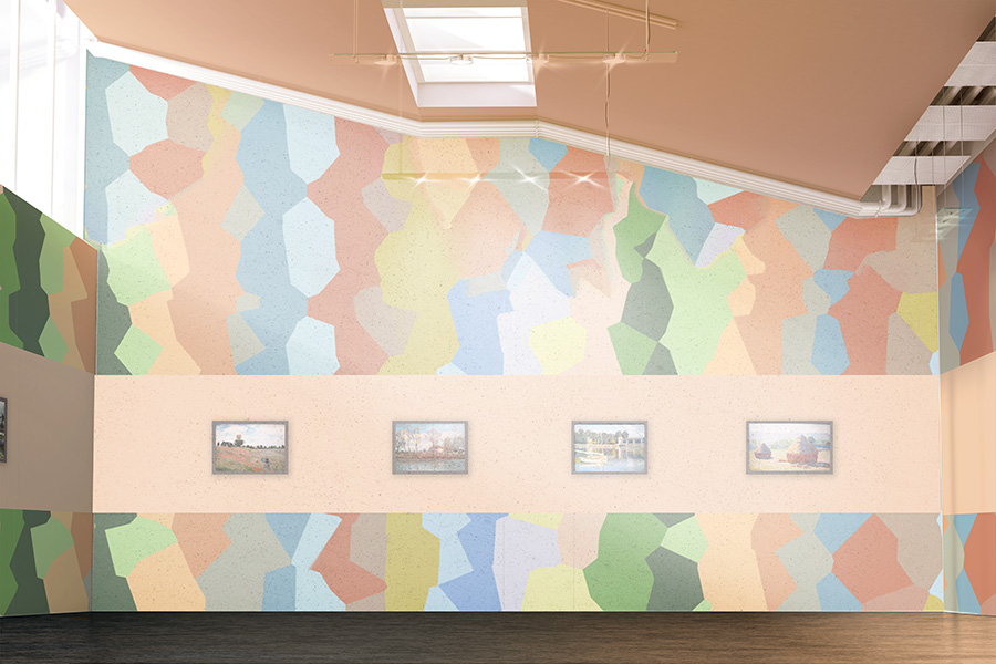
The background of the hall is dominated by the staggered gradient of warm and cold colors, showing a mottled light and shadow effect, like the subtle reflection of light on the water in Monet’s paintings. The wall design uses color gradients and changes to guide the audience to immerse themselves in the interweaving of light and shadow, allowing them to feel Monet’s clever use of light and color and his emotional expression.
In this section, five different styles of exhibition hall background wall patterns continue to be displayed. These designs incorporate Monet’s artistic tones and create a multi-dimensional visual experience through the clever combination of colors and shapes. The background wall design aims to break the boundaries of traditional exhibition spaces, allowing the audience to feel the agility and breadth of the works from every angle.
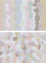
This background is dominated by soft pink, lavender, and light gray, symbolizing the tranquility and interweaving of light and shadow at dawn. Through the blending of color gradients and geometric shapes, a quiet and warm atmosphere is created, which is suitable for showing the subtle changes in the morning and light in Monet’s works, echoing the soft tones and emotional expression of the works.
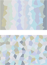
This background is dominated by light blue and gray-green tones, presenting a broad visual effect of the sea and sky connecting. The combination of soft cold tones and irregular geometric designs shows the tranquility and depth of nature, as if bringing the audience into Monet’s seascape paintings, feeling the boundlessness and tranquility of the sea and sky.
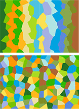
This background uses bright green, yellow, and blue to symbolize the vitality and vitality of nature. The design of geometric color blocks is full of dynamics, showing the free combination and change of colors, showing the vividness and diversity of colors in nature, and echoing the green world and natural landscape in Monet’s works.
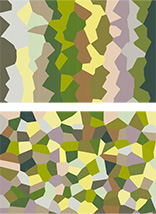
This background is dominated by soft green, yellow-green, and brown tones, showing the scene of sunlight shining on the vast fields. The combination of geometric patterns and the change of colors form a scene full of natural atmosphere, evoking the audience’s association with the pastoral scenery in Monet’s works, giving the space a tranquil and harmonious atmosphere.
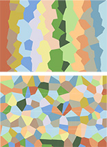
The colors of this background pattern are mainly warm tones, using a gradient design of orange, green, and light blue to show the changing light and shadow of the setting sun. The arrangement of geometric color blocks is free and rhythmic as if capturing the pastoral scene at sunset in Monet’s works, giving the audience a warm and peaceful feeling.
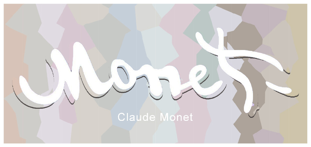
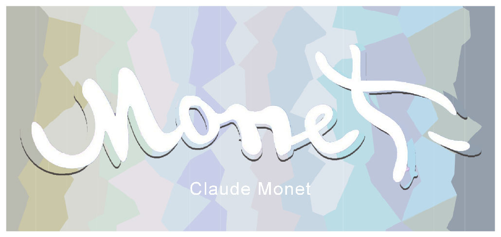
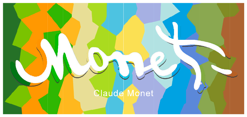
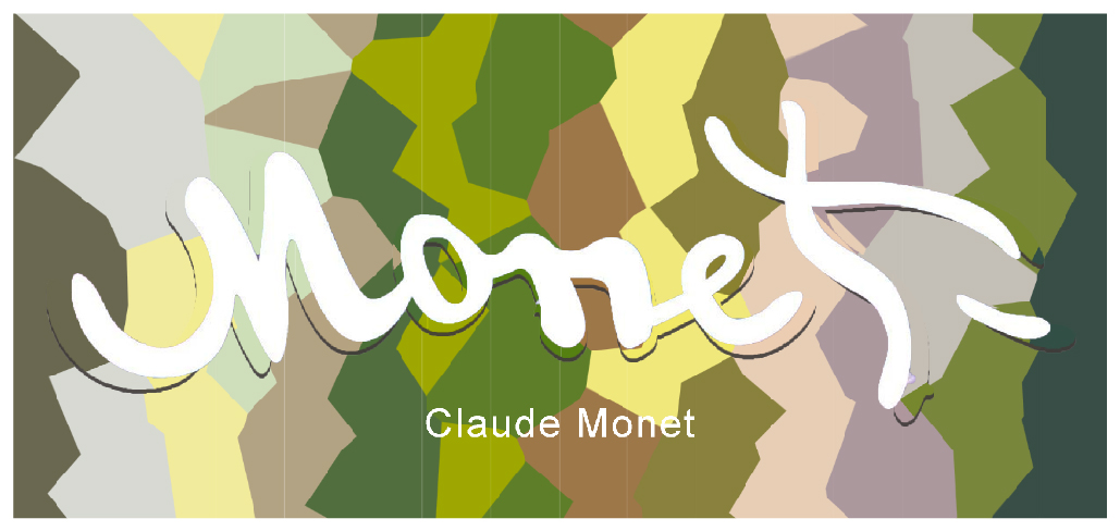
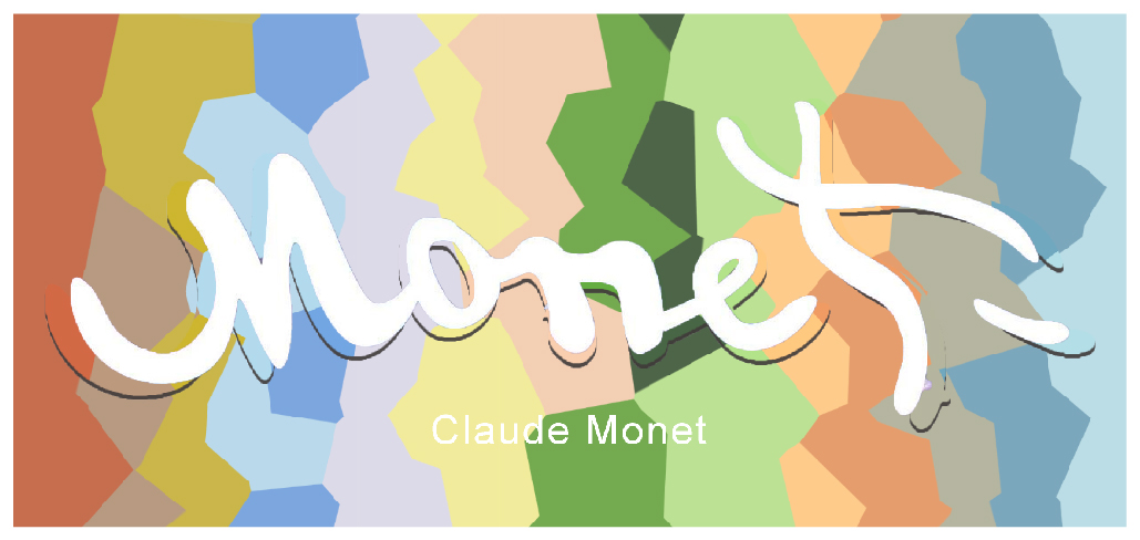
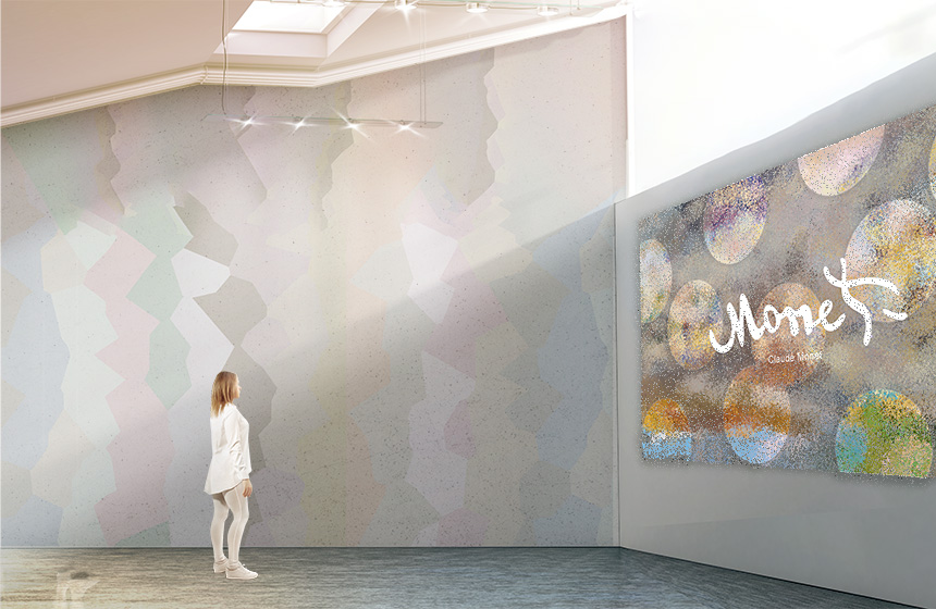
The logo that matches the exhibition hall’s visual design debuted in this section. The logo design is closely combined with the tones of the background wall, and the overall visual language of the exhibition is further strengthened through clever font and graphic design. The audience will find consistency with Monet’s painting style in the Logo, which enhances the connection between visual cognition and the theme of the exhibition.
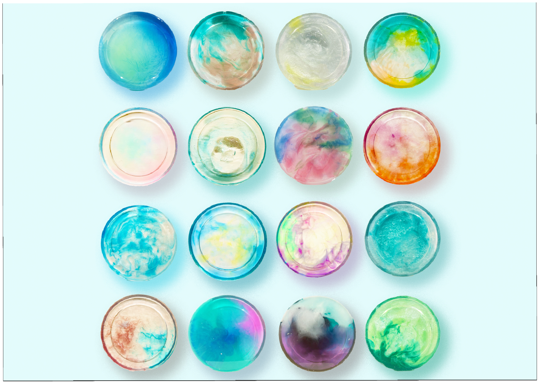
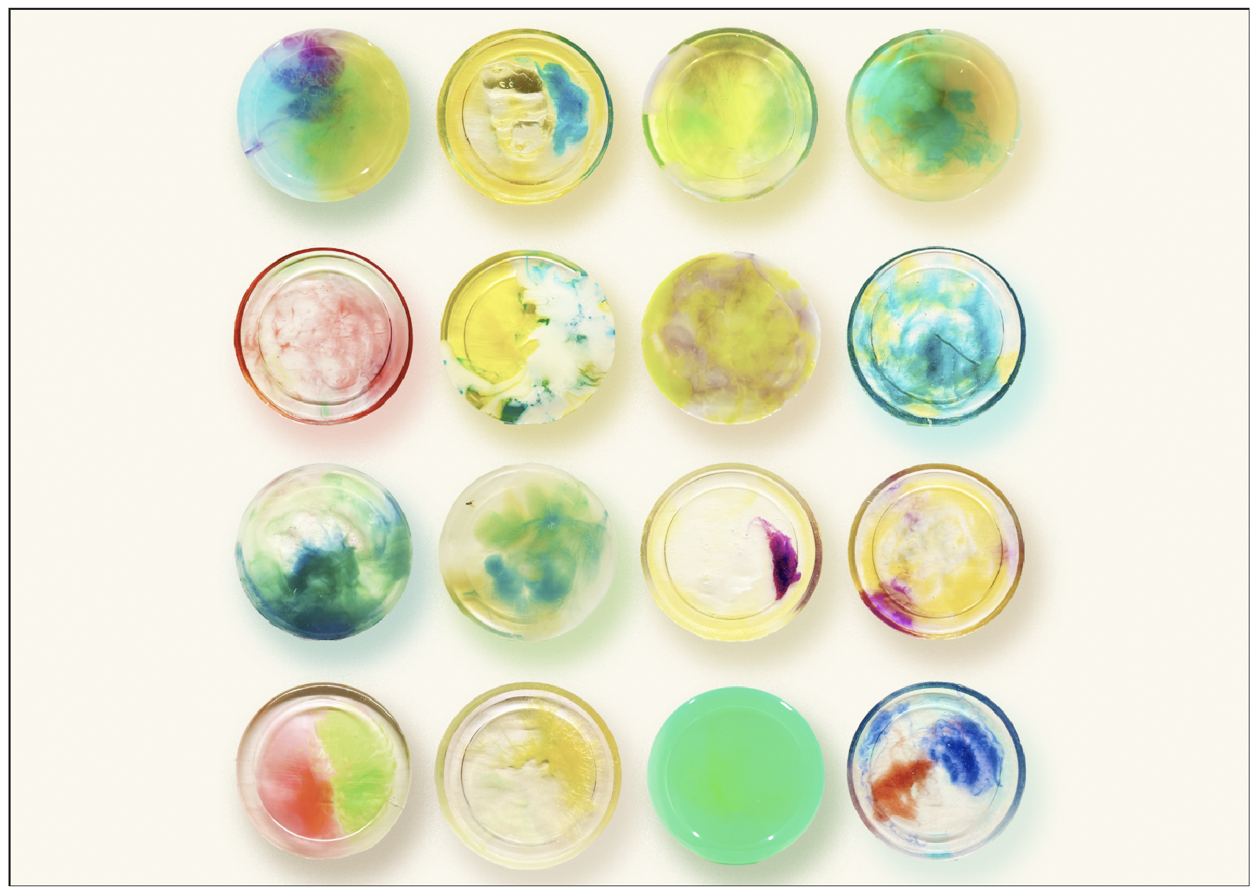
This part displays epoxy resin crystal glue crafts inspired by the tones of Monet’s paintings. Each work is like a condensed color moment, conveying the emotions and agility in the painting. The carefully arranged installations form a visual focus in the exhibition transition space, providing a place for the audience to rest and think, and enhancing the immersive viewing experience. Behind each work is an exploration of space and visual language, extending the boundaries of art.
This section displays epoxy resin crystal glue crafts developed based on Monet’s color tones. These small and exquisite crafts not only convey rich changes in color, but also create a spatial texture similar to that of artworks through the transparency and light and shadow effects of the material. Each work is an independent artistic expression, while bringing visual interest and detail to the entire exhibition.
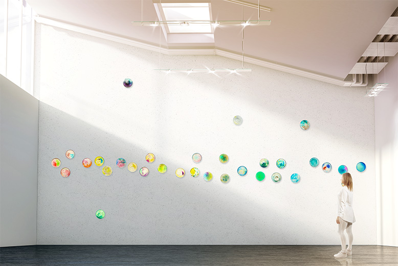
In this section, the installation application of epoxy resin crystal glue crafts is displayed. The crafts are installed on the exterior wall of the exhibition hall in a random linear arrangement, forming a very creative visual device. The device not only plays a visual guiding role, but also provides a transitional resting space for the audience, further deepening the emotional immersion of the exhibition.
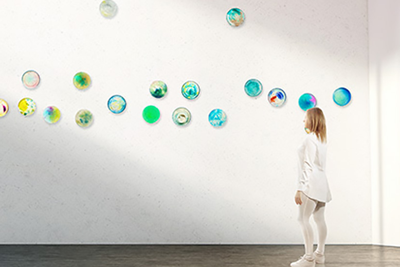
This part presents the creative mouse-drawn background design, which is based on the colors of Monet’s paintings and uses the layering technique of airbrush brushes to create a rich visual texture. These background designs are used for promotional materials outside the exhibition hall, such as entrance signs, banners, posters, etc., to convey the visual resonance of the exhibition theme and the emotional pulse of the space. Through these applications, the audience can feel the artistic atmosphere and design concept of the exhibition before entering the exhibition hall.
This section shows three illustrations created by mouse-drawing technology. These illustrations use airbrush brush technology to create new visual effects by layering colors and graphics in Monet’s paintings. These creations are mainly used in exhibition promotional materials, such as posters and billboards, adding more visual impact and artistic appeal to the exhibition.
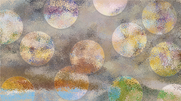
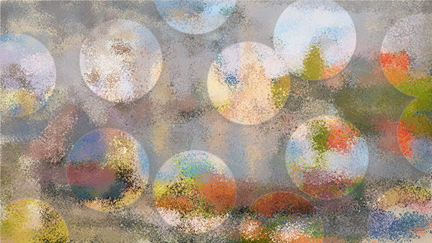
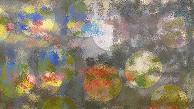
At the entrance of the exhibition hall, the creative images drawn by the mouse are perfectly combined with the exhibition logo to form the main visual symbol of the exhibition. This design not only enhances the recognition of the exhibition, but also attracts the audience’s attention through the harmonious combination of colors and graphics, and stimulates their curiosity and expectation for the exhibition.
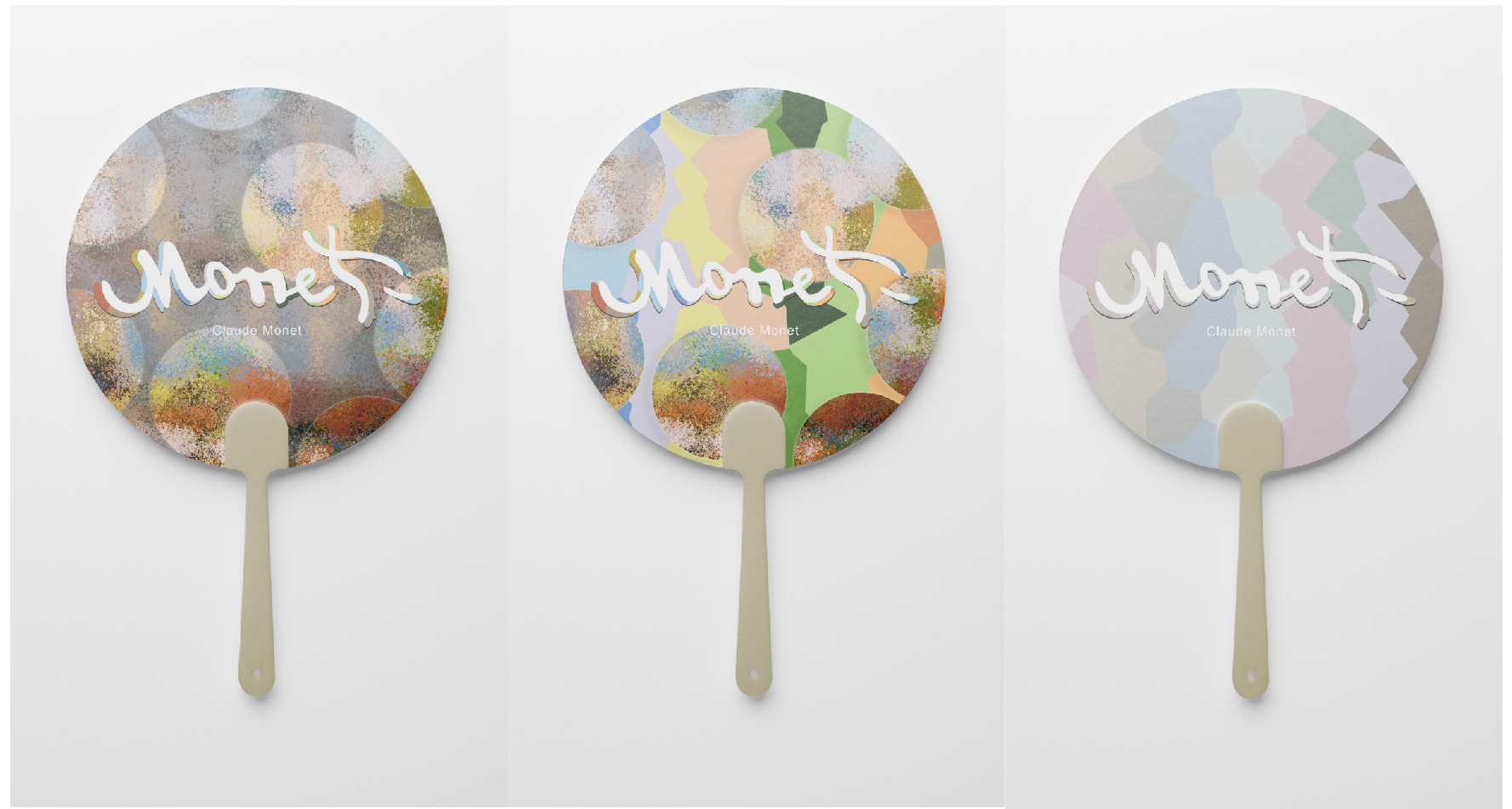
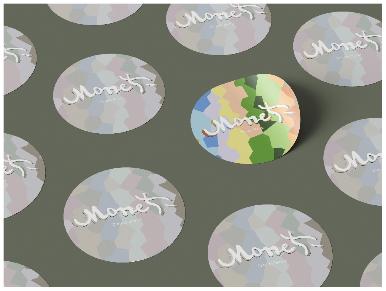
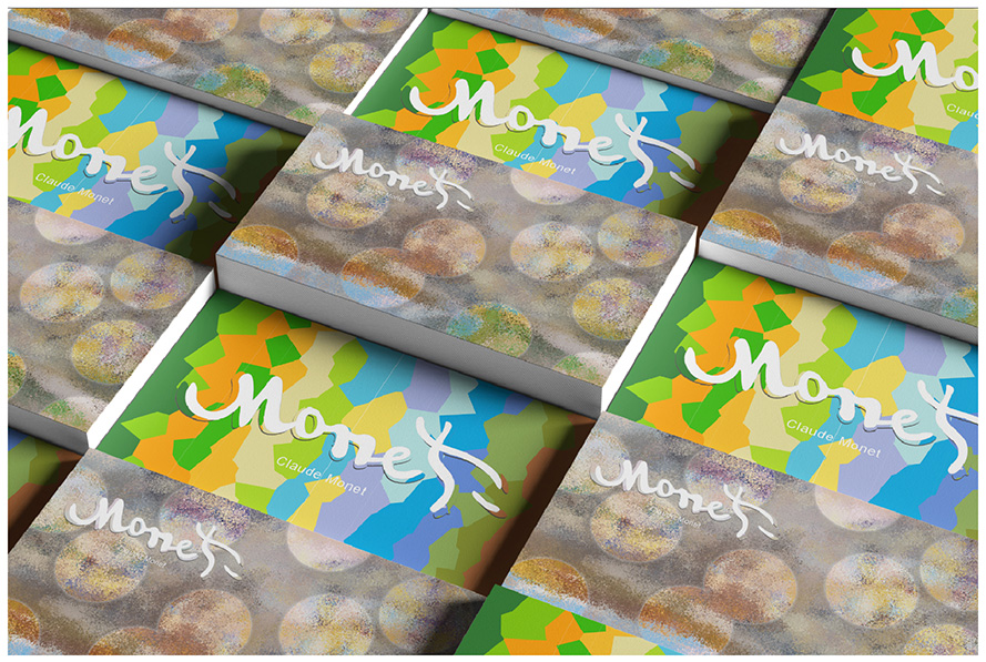
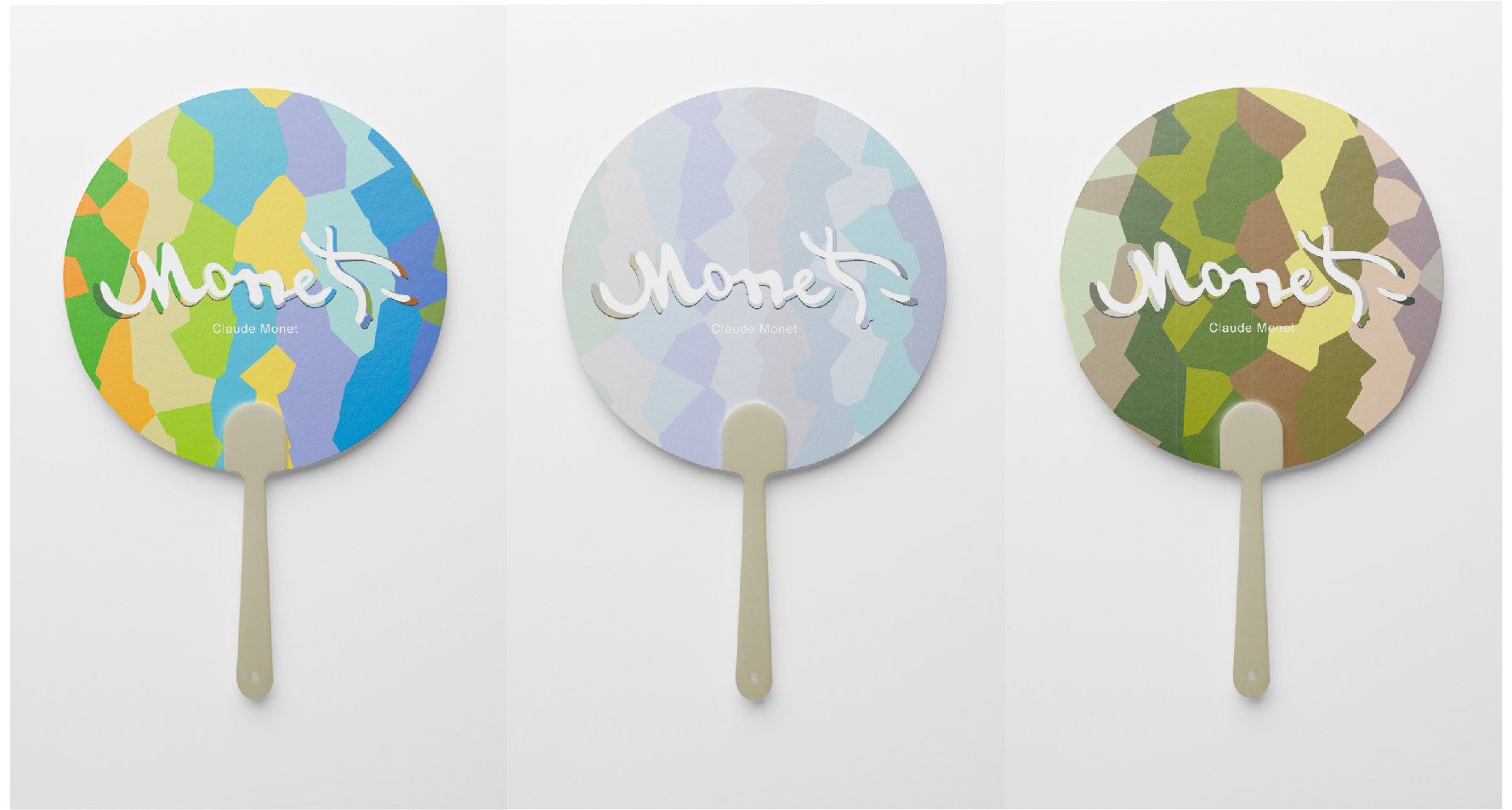
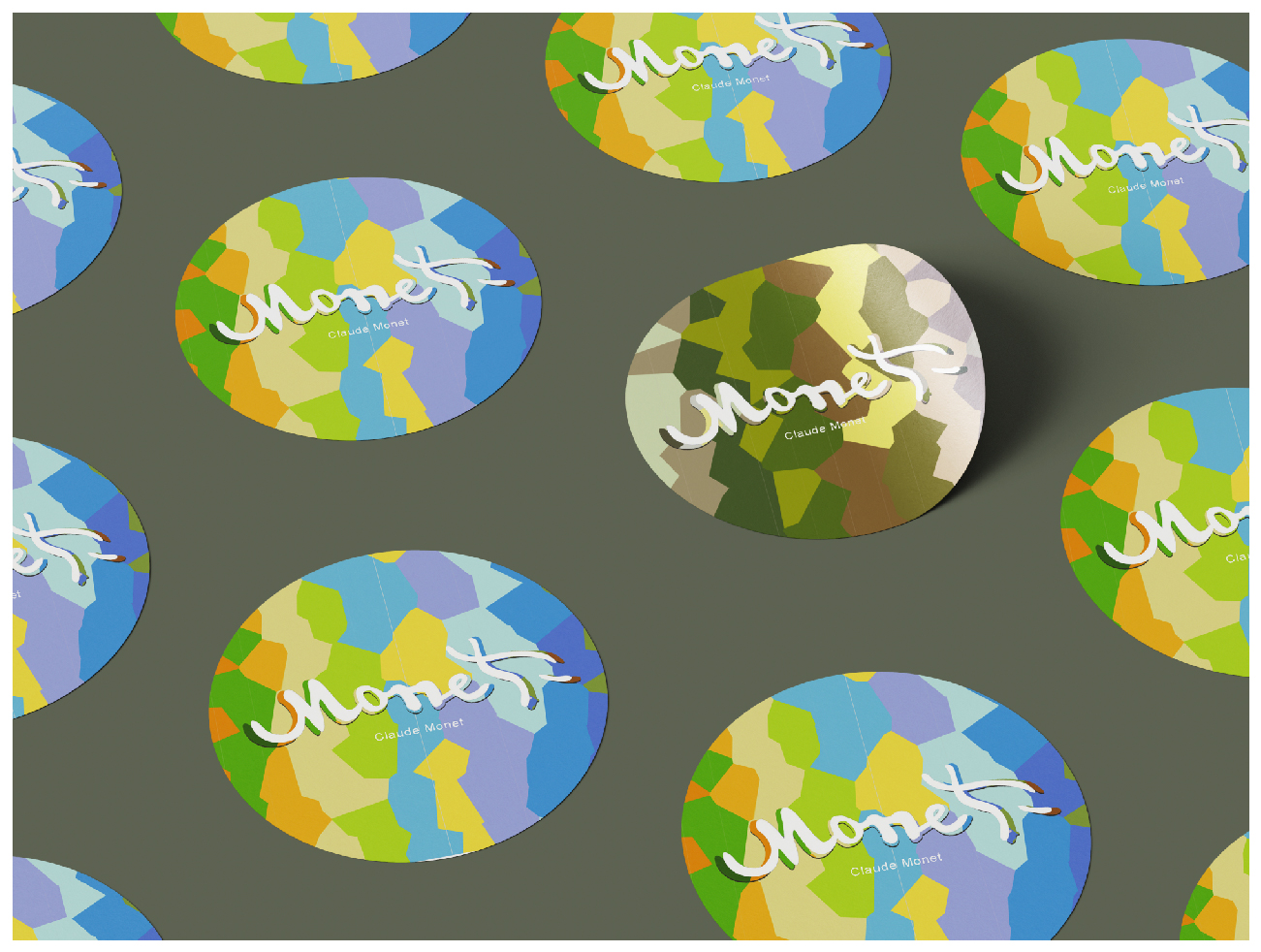
In the last part of the exhibition, we extend the visual echo to the design of peripheral products for the exhibition. The exhibition designed exquisite fans, stickers, and business cards for the audience. Each peripheral product is inspired by the color and background design of Monet’s paintings, conveying the visual language and artistic emotions of the exhibition.
These surrounding designs not only continue the visual resonance of the exhibition, but also provide visitors with opportunities to interact with the artworks in their daily lives. Through these exquisite designs, visitors can bring the experience of the exhibition home and continue their emotional connection with the exhibition.
